Analyzing the results
Logic
All loaded results are aggregated per country (pre-calculated in the "Calculation" part).
GHG intensities are calculated by dividing the sum of emissions over a territory by the production of crops (converted to MJ of fuel).
To analyze EU27 consumption emissions:
- EU production is calculated from cultivated area and yield
- Imports are used from "Crop_trade" module
GHG intensity of EU consumption is simplified to be the weighted average of GHG intensity of EU production and EU imports. EU exports are considered low enough to be omitted.
Results
Overall results and comparison with old GNOC
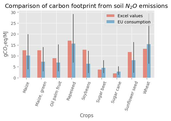
The figure represents the comparison between the updated N2O emissions from feedstock cultivation and the previous values. As for the previous values (in red), the updated values (in blue) calculated correspond to the EU consumption considering the EU domestic production and the import when relevant. For most crops, changes are minors either in absolute or relative values. The uncertainty bars correspond to values calculated using the lower and upper range given in the IPCC report for the emissions factors.
Sanity check per crop
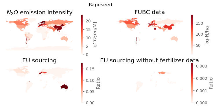
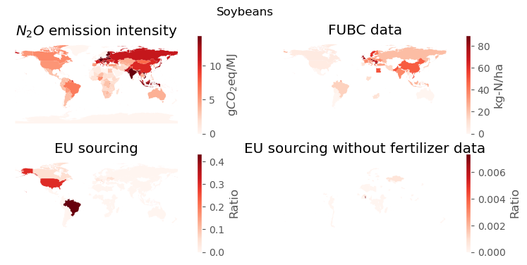
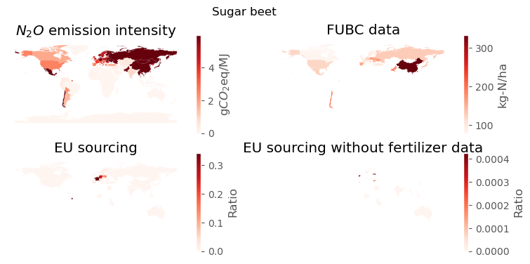
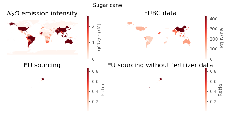
Some charts are created to quickly visualize the distribution of main input parameters and the availability of data for each country.
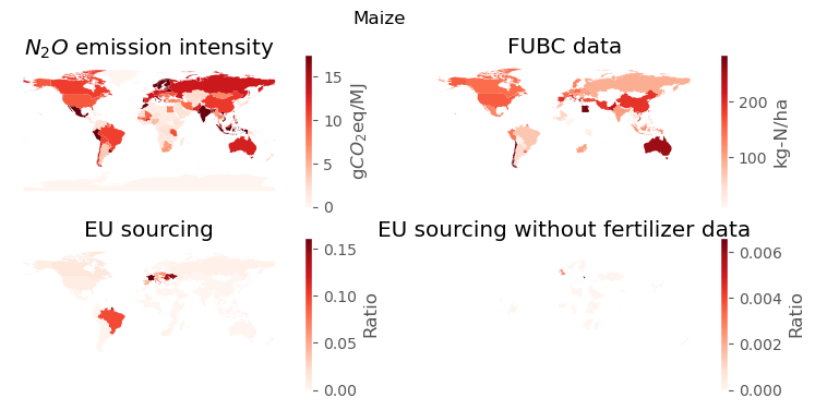
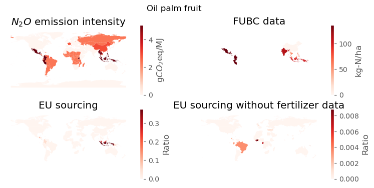
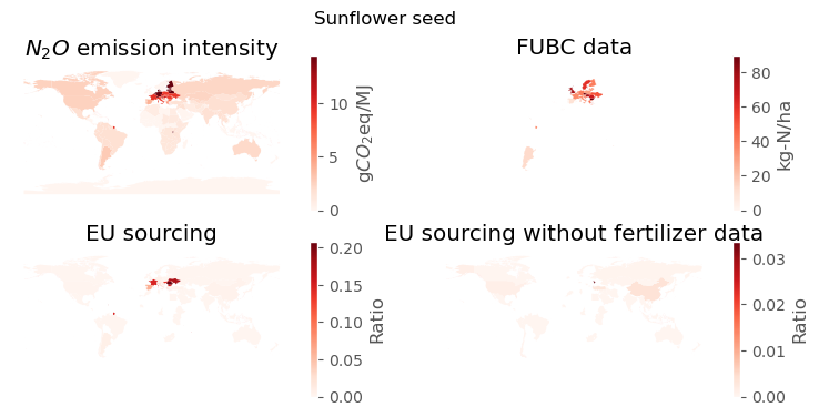
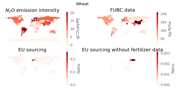
The figures represent maps that were used to check, for each crops, the geographical coverage of the N2O emissions calculation. The first map presents the N2O emissions intensity per country in gCO2eq/MJ. The color bar scale was adjusted to the statistical distribution. In practice some countries can have very high intensity when they have a marginal production of a crop. The second map plot the FUBC data for Fertilizer Use By Crop. Those FUBC data covers 64 countries of the world including all countries with an industrial agricultural production system. For instance, we can see that most African countries do not have data. This map has to be compared to the third one that give the sourcing of the EU consumption for the given crop. We can see here that having no fertiliser data for African countries is not problematic and the Maize EU consumption is not sourced from African countries. Finally, the last map present the countries contributing to the EU consumption for which we do not have data. It is important to note the scale of the value represented, and those countries never represent more than one percent of the EU consumption.
Using those maps, we ensured to have a good coverage of data required to assess correctly the N2O emissions for the EU consumption. For instance, we saw that oil palm EU consumption was sourced from some central American countries and Papua New Guinea, that are countries not covered by the FUBC data. We filled those values respectively by using the fertiliser use in Mexico and Indonesia.
Warning
Trade data for sugar cane were not available from Eurostat. As a consequence maps for EU sourcing are not valid. To calculate emissions, we used world production.
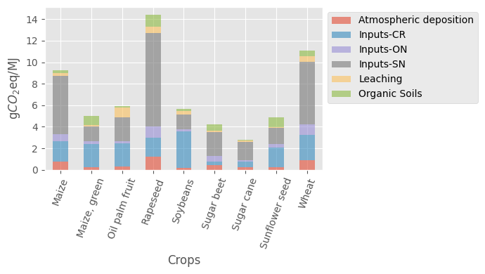
Contribution of the different N2O sources
The figure present the contribution of the N2O emissions. Inputs-SN, ON and CR respectively corresponds synthetic N-input, organic N-input and inputs from crop residues. We can see that, for most crops, the use of synthetic fertilizer is responsible for a significant share of the N2O emissions.
Comparison with old GNOC values
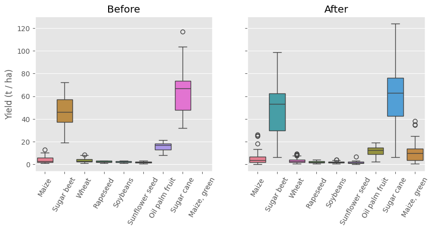
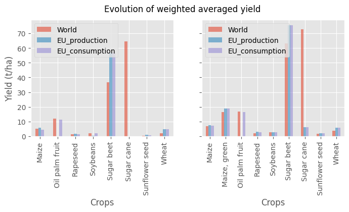
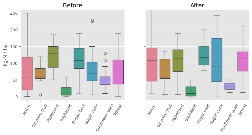
For the most important input parameters, we compare the values before (old GNOC tool) and after (this tool). For each country, we calculated the average yield, then the distribution of those values is displayed in the figure below.
Weighted averages are then calculated in three ways considering the weight of each country in the world production, the EU production, and the EU consumption. Those values are displayed below.
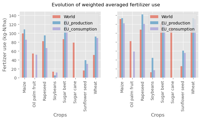
The same procedure is followed for the fertilizer use.
The figure below aims at understanding and explaining the relative change between the old and updated values. The red bar correspond to the ratio of carbon footprint or N2O emissions. A value lower than one indicates a decrease of the footprint. The blue bar corresponds to the ratio of synthetic fertiliser used between the updated and old data for the production of the crop. The purple bar correspond to the ratio of yield between the old and updated data. As it is not easy to directly compare those data, we calculated a ratio of the ratio giving the fertilizer use evolution, and the yield evolution. If there is an increase of the fertiliser use as for maize, we can expect to an increase of N2O emissions, but if the yield increase is stronger, we can expect to a decrease of the footprint. This is exactly what is observed for maize, wheat and most crops for which this Fertilizer/Yield ratio is a good proxy to assess the change of footprint.
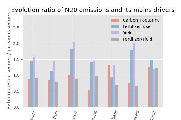
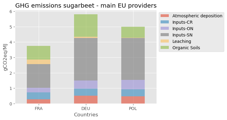
For soybeans, we can see that this Fertilizer/Yield proxy fails to explain the variation. This is because the N2O emissions of this crop cultivation are not dominated by the synthetic input, but by crop residues related emissions. The increase of yield also lead to a reduction of those emissions per energy content produced. Also, sugar beet variation are not explained by the variation of those parameters, but by a change of the EU sourcing. The EU sugar beet production is mainly sourced from France, Germany and Poland. The carbon footprint due to the N2O emissions are presented below. We can see that performance is slightly better in France that in Germany and Poland. Between the old and updated data, the share of production from France decreased, which explained the slight increase of the N2O intensity of sugar beet production. This effect is visible because the emissions are low and represent a variation of less than 1 gCO2eq/MJ. A value, much lower that the uncertainty related to the N2O model provided by the IPCC report.